If you check the source code of a website’s front-end at random these days, chance are you’ll find Bootstrap underneath. We’ve all become so used to concepts like container-fluid, row, col-sm-6, etc., that it’s hard to imagine that any other style of front end development is even possible. And so when we have to build the next project, we reach for Bootstrap unconsciously. That said, the popularity doesn’t make Bootstrap a good fit for all projects and needs. In fact, for really lean frontends, loading all the Bootstrap CSS and JS can cause major bloat. This article has two purposes: I think the explanation part is really important because in most cases, people don’t even realize they have a problem or that they’re making their job harder by picking up Bootstrap. Finally, please note that this is not an anti-Bootstrap post by any means. I love Bootstrap 4 and use it whenever I can. But, then, I’m an individual developer who has to think of using the most popular solution; also, I’m not a UI developer per se, so I don’t worry about too many things when building out my front-ends. And with that, let’s have a look at what alternatives we have.
Flexbox Grid
Think about it for a minute: the biggest reason you started using Bootstrap and are still using it is its grid system. Sure, it took some getting used to the row, col-md-6, etc., classes, but now it’s second nature to think of a layout in terms of rows, columns, offsets, etc. And if you’re honest with yourself, you’ll find that everything else in Bootstrap is a bit of a chore to work with. There are tons of classes to remember, whether you’re doing forms, navigation, buttons, tables, or anything else. If you’re like me, you’ve still not gotten used to all the classes and what they do, and you often use Bootstrap only for the grid and write all the other CSS yourself. If yes, you could do a lot better with Flexbox Grid.
The Flexbox Grid, as the name suggests, is a grid system based on the CSS Flexbox properties. However, unlike the CSS technique, all the complexity is nicely abstracted away so that you focus only on placing elements the way you want. The best part is that all the code and class names mimic what you’d want in Bootstrap 4, which means switching between these two tools requires zero mental friction. For instance, here’s what code for the “space around” looks like in the Flexbox Grid: The minified CSS file for this grid system is a mere 10.7 KB saving you several hundred KB in the final download size. These days the Flexbox Grid is my favorite as I don’t want to fight Bootstrap to customize it fully. I like to start with vanilla elements and style them myself, using the Flexbox Grid wherever I need to. Learn Flexbox here, online.
PureCSS
Wouldn’t it be nice if Bootstrap was split into modules and you could import only the module you needed? Well, PureCSS has gone ahead and done just that — it’s a set of modules covering different functional areas of a website. You can choose to download one or all, and yet the download size won’t exceed 3.7 KB!
Yes, you read that right. All the modules when bundled together and gzipped are 3.7 KB, although individually they amount to more. The grid module is just 0.8 KB, while the Base module is 1.0 KB. The team behind PureCSS says that it was built entirely with mobile devices in mind, and so every line of CSS was carefully scrutinized for efficiency before being included. So let’s say you need just the grid and forms module. Well, just download these two (along with the Base module), and you’d be done in less than 3.4 KB! No need to include the CSS from Buttons, Tables, and Menus modules if you’re not going to use them. PureCSS has its classes, though, and the resulting code doesn’t mimic the Bootstrap you might be very used to: You’ll notice that there’s no 12-column grid anymore. PureCSS has its grid system that specifies how much width a column should take. So, pure-u-lg-1-4 means that this element should take 1/4 or 25% of the available width on large screens. Widths as multiples of 1/5 are also available. All in all, PureCSS is a liberating and amazing CSS tool (framework?) that you can pick and choose from as needed. That said, it does come with a fair amount of buy-in and learning curve as you need to learn a new (slightly different) way of doing things. PureCSS also has its own classes and default styling, so in that, it’s not too different from Bootstrap.
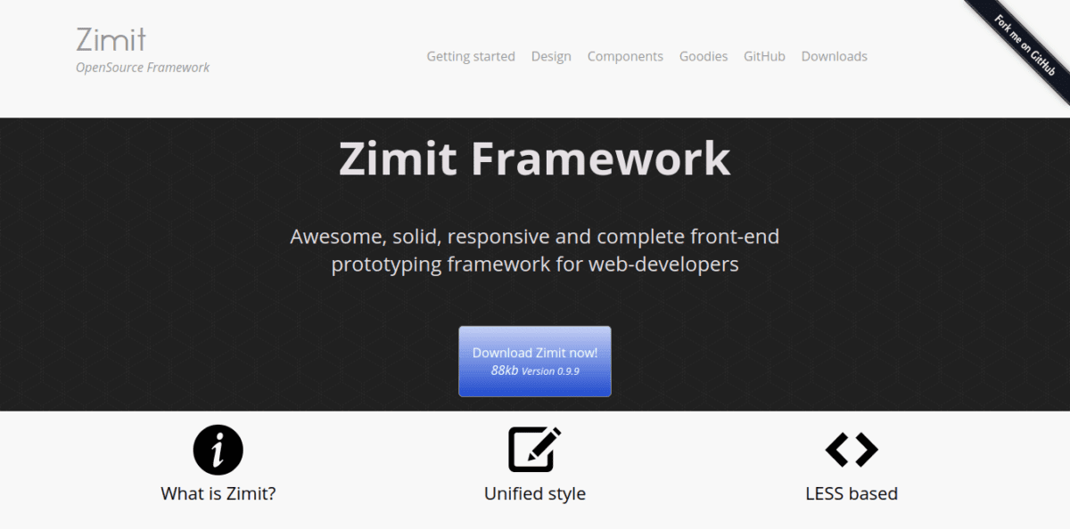
Zimit
The Zimit framework is kind of an odd-man-out in this list. Yes, it’s a framework for building UIs, but it’s aimed at particular types of UI: mockups.
There are times when you have to develop the front-end for showing the functioning of the product. The ideal way to do this, of course, would be to get a UI designer/developer involved and create the mockups on one of the advanced wireframing tools (Moqups, Blasmic, etc., come to mind). The pages would be pixel-perfect, the color scheme sleek and well-chosen, and the pages would be open for participation, reviews, comments, etc. But real life is not ideal, and often you’re the only man on the job and must wear all the hats and get the job done. At those times, you want a framework that:
Allows you to code in HTML/CSS Is lightweight Has an extensive collection of fundamental components Has a decent and consistent style language If possible, resembles the “greyish” tone of wireframe design Is easy to learn Has some CSS preprocessor built-in
Zimit checks all these boxes. It’s just 84 KB in size and has a wide range of components to choose from. Here are some examples that I found really appealing, as coding them on your own will take a lot of time. Tree view
Breadcrumb
Tabs
There are many more goodies to explore. Check them out here. Let’s look at what the code looks like. Here’s how you’d use the grid system in Zimit: The “c” here stands for “column,” so “c4” means a column that spans four units (the grid being 12-size, just like Bootstrap’s). Very similar to Bootstrap, and very intuitive, in my opinion. All in all, Zimit is a complete and easy framework to develop UI prototypes that are responsive and look good quickly. It’s better than Bootstrap (when it comes to prototyping) because Bootstrap is a much larger download and the resulting design is, well, tacky.
HTML KickStart
In most of the projects you build, speed is critical. The biggest hurdle to speed in web development is the front-end part, and the biggest “delayer” in front-end development is the need to code elegant-looking, interactive components. Since there are many ways in which a component can behave, and there are many screen sizes to manage, coding, and managing components can become a nightmare for the developer. HTML KickStart offers an alternative.
Put simply; it’s a collection of really sleek components that you can just drop into your projects and cut down the development time drastically. Here are some nice components I found: Dropdown
Buttons
Tabs (centered and with icons)
Materialize
If you like Bootstrap for the fact that it has a readymade solution for all common web design problems, but you’re a fan of Material design style, you should try out Materialize.
Materialize is mostly just like Bootstrap — 12-point grid system, offsets, and familiar components like forms, cards, etc. However, it does have certain goodies that can appeal to many. Push-pull The push/pull feature of Materialize CSS allows you to reorder columns. This is reminiscent of the new CSS Grid standard, where the layout is different from element order. This results in the following:
You’ll notice that the columns have switched places, which is something perhaps unachievable in traditional Bootstrap-based CSS. JavaScript goodies There are quite a few JavaScript features and effects that ship with Materialize. Tooltips, Toasts (Android-like ephemeral notifications), Parallex, Pushpin, etc., are some of them. One really amazing effect I liked is FeatureDiscovery, which basically allows you to highlight an element on the page on some event (say, button press) to bring the user’s attention to that element. It’s hard to describe it in words fully, so head over to https://materializecss.com/feature-discovery.html to see what I mean. All in all, Materialize is a great alternative to Bootstrap or for those looking to adopt a full-featured Material CSS framework. Conclusion Bootstrap is synonymous with responsive design. It was Bootstrap that popularized the term “mobile-first design” and showed how it could be done. But while Bootstrap gets the job done most of the time, just getting the job done isn’t always enough. If you feel like Bootstrap is restricting you and that your needs are special, one of the options listed here will help. 🙂


